Marketing Campaign
Print Design and Digital Design
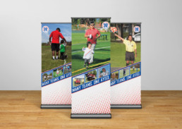
The creative brief on these roll-up banners was fun, interesting and complicated all the same time. I was asked to create two distinct looks that included a diverse group of children playing soccer as well as volunteers, all while having a sporty feel and including a new tagline.
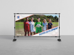
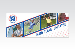
An angled blue field cutting across version one was a great way to bring in additional images without having to resort to a dated looking collage. Each one included one main image and three child images. This enabled me to create the version two banners as single image banners with a more athletic look and feel. This look was my favorite of the two.
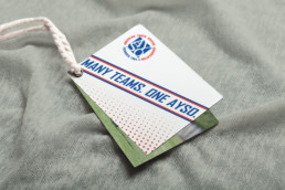
My favorite part of these roll-up banners is that they were an immediate hit, with regions from around the country asking for us to make the artwork available to them. Since then, our marketing director asked me to create a marketing campaign using this look. So far it includes roll-up banners, social media posts, vinyl banners, bag tags, and table tents with more to come in the next few months.


