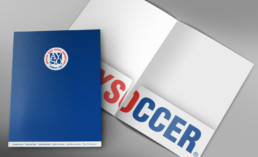
Presentation Folder
Print Design
This presentation folder was a replacement for an existing folder. The previous version was a very dated looking collage with some design flaws. It included some flipped images where the logos were backwards, as well as including some past sponsor logos that we are no longer .
For this replacement piece, I tried to keep things as simple as possible. By using only the logo, I eliminated the possibility of sponsor changes being an issue. By keeping the design clean it gave it a more modern look. Using the PLAYSOCCER logo on the interior pocket was a great fit and an instant hit that everyone loved.
