Playground Soccer Logo
Logo Design, Branding, Print Design
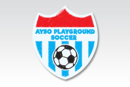
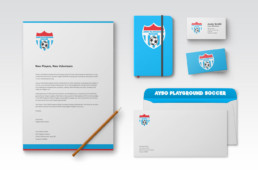
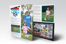
The Playground Soccer logo is a project that I feel really hit the mark. AYSO was looking to update the look and feel of this program. It needed to convey that it was a soccer program for kids ages 3-5 . By incorporating a shield and stripes it gives it a legitimate soccer feel. Including a scribble effect and brighter color palette give it a happier, younger feel. While I normally do not like to add literal elements, such as a soccer ball, to a logo, in this case I think it was important based on the young age of the participants. This logo was originally only used on a few limited items- website, shirts, business cards, etc., I am pleased to see that they are now making a push to increase the size of this program, and I recently did this magazine layout for the program.


