Magazine Layouts
Print Design
Normally, our magazine articles are tailored towards kids. In our most recent issue, we received some outstanding content from out staff, volunteers, and the LA Galaxy. This gave us a chance to do a few layouts that have a more grown up feel.
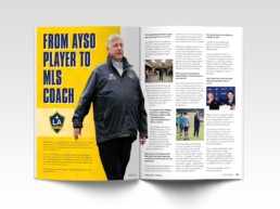
These two are my personal favorites from this issue. With the Galaxy layout, we received solid photos (almost unheard of for our all volunteer organization), and very well written interview piece.The layout is a standard two page spread. I was ran a clipping mask around the main image to incorporate a text wrap. Using the Galaxy logo and team colors tied it all together.
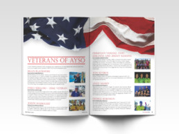
The veterans spread was a bit more challenging. Some of the images were very low resolution. Choosing the flag to go across the top of both pages was a good way to minimize the size or the provided image. The headline font was a traditional looking serif font to help provide a mature and patriotic feel.