Logo Update
Logo Design, Branding, Logo Update
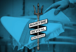
This logo revision was an interesting project in that I both broke and followed my own logo design rules.
Where I followed the rules was for the most part straight forward. It was created as a vector graphic in Illustrator, I kept the logo to black and white, and it is simple enough to read. Add to that that I really dont like to be too literal with symbols, icons, etc. In this case I pulled inspiration from traditional ocean symbols and went with a Trident.
I broke the rules by giving this logo a redesign. Normally I council just about everybody to skip the redesign unless it is absolutely necessary. It can be detrimental to branding and consistency. But the old logo was really just for me to use, and all of my boards were starting to look the same. White board, scribbled circle logo in black on nose on the deck and bottom. I needed a change.
Plus I just enjoy designing logos. They are a labor of love for me. The new board is shaped and should be back from the glasser soon.