Salt & Stoke Logo, Poster and Graphic Tee
Logo Design, Branding, Apparel Graphics, Print Design
To me, nothing is better than surfing head high waves with nobody else out. Salt & Stoke is a new pet project for me, I love the direction so far and my first samples shirts are on the way to me now.
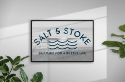
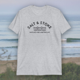
For the logo, I wanted it to be simple, have a bit of that California vintage vibe and look a bit weathered. I got there fairly quickly with the text, but the waves were a bit tricky. I was initially going with a silhouette profile of a single wave, but that seemed be too similar to many of the current brand logos or too clunky. After running through a few concepts I settled on the the three set wave lines you see now on the poster and the gray tee.
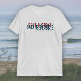
The white tee was finished very fast. It incorporates part of the logo- the front font and set wave lines. I wanted it to look hand painted and vintage, so I the back text is a different typeface. The red and blue offset each other and look great on the white. Cant wait to see what the reaction is too the sample shirts.